Case Study - An Object of Beauty
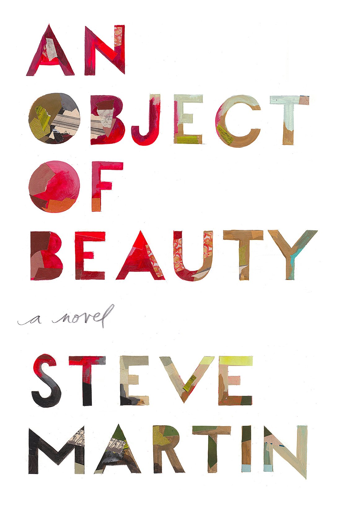
Challenge: Create a typographic cover that referenced fine art painters without borrowing from any specific artist.
Outcome: Working under the creative direction of the talented Anne Twomey, the resulting cover features unique, painterly, richly coloured bold letterforms, and an iconic design that stands out on crowded shelves.


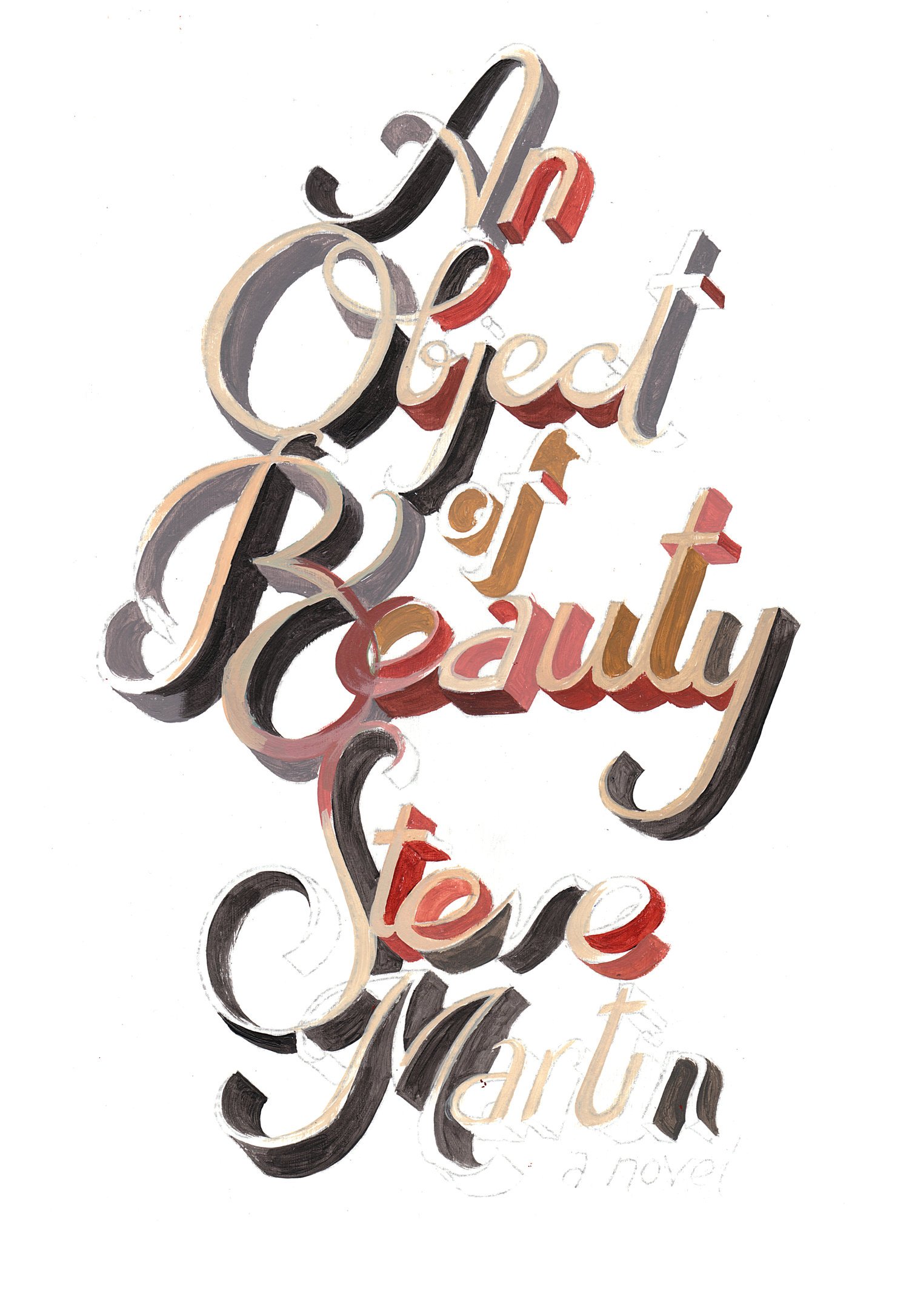
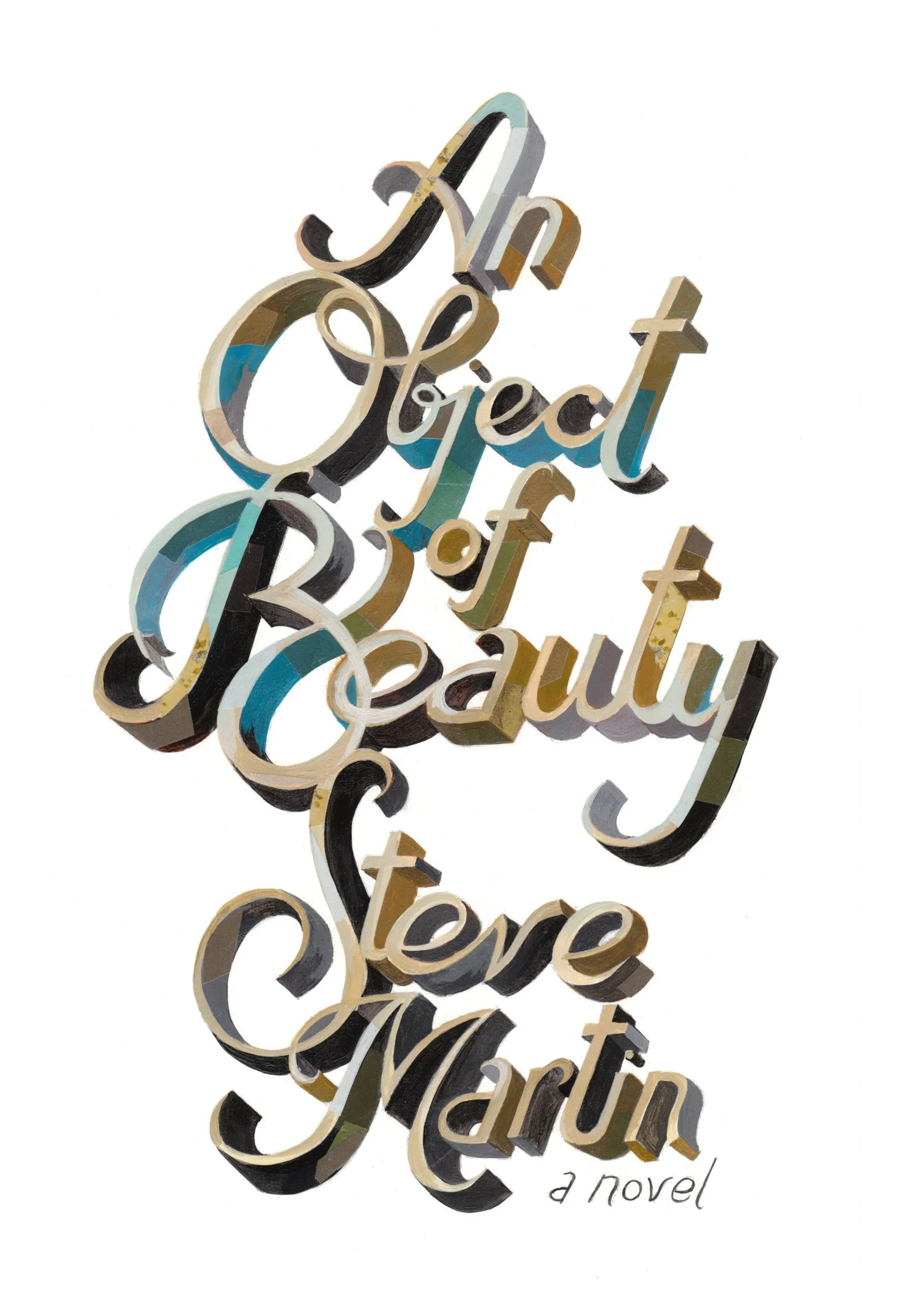
Some process + and a sample test that I produced to help show the look and vibe I was aiming for. During the research stage of the project I learned that Steve Martin collected the work of fine artist, Ed Ruscha. With this information, I used Ruscha’s sparse typographic paintings as a rough guide for an appropriate lettering style.


Below: An early direction that clearly wasn’t right as it felt too much like a romance novel and was too ornate.


It was fun seeing the work on national television!


It’s all about the details
The book also features some great visual and textural details that are great when experienced in person, including an ultra-gloss lamination on the typography and a paper stock that emulates primed canvas. This helps the book look and feel like it’s a piece of art.
Title cards mock-up
I’ve always imagined the lettering being used for the opening credits of a film or TV series. It’s definitely on my bucket list to create it if it ever becomes a film, btw! In the meantime, I created a few of my own title cards as if it were a TV series. Also kept them brief so a viewer wouldn’t need to Skip Intro while binge watching. The sequence is mostly comprised of photos I took of friends in NYC at the start of my career, which coincidentally is also when the story takes place in the book. My thinking was the photos would change from episode to epidode but the animation and backing track would remain consistent.
Abstract art end pages. Which have since been sold to a private collector.


